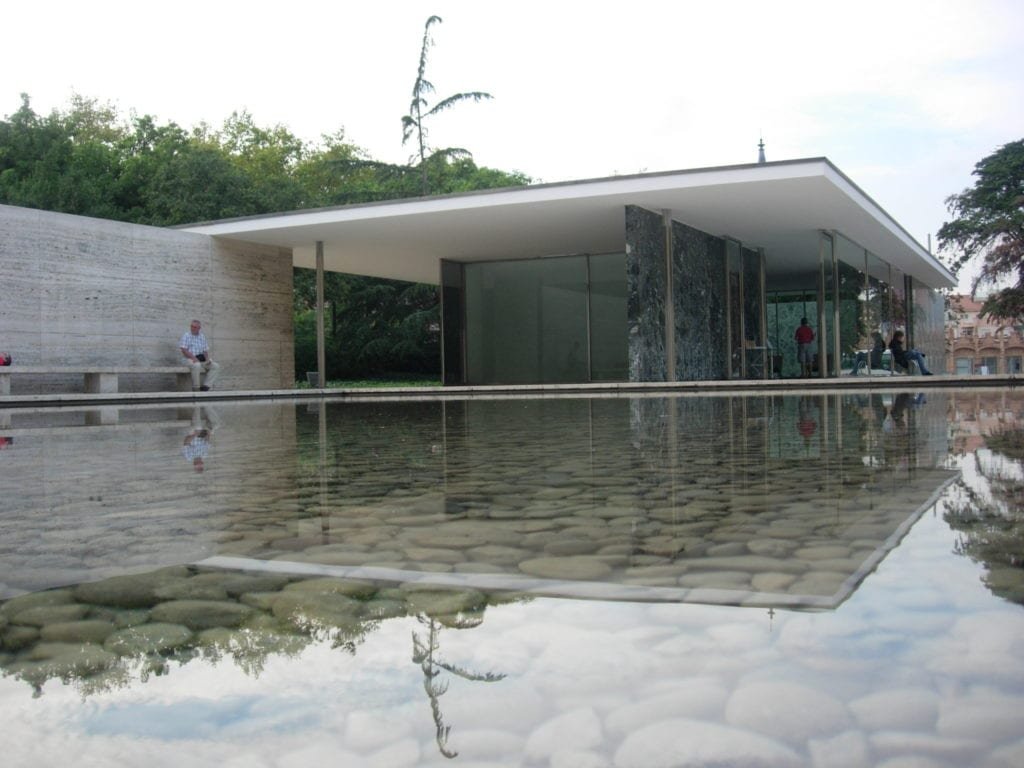
As a property owner or developer, selecting the perfect Building Elevation Colours scheme for your building elevation is essential. The colors you choose can impact the overall aesthetic appeal, ambiance, and even property value. In this article, we’ll discuss the various aspects of building elevation colors and provide you with tips on how to choose the perfect color scheme for your property.
Understanding the Psychology of Building Elevation Colours
Before selecting a color scheme for your building elevation, it’s important to understand the psychological effects that colors can have on people. Here are some of the most commonly used colors for building elevations and their associated psychological effects:
Red
Red is a bold and intense color that exudes energy, passion, and excitement. It’s an ideal choice for commercial buildings that want to attract attention and stand out from the competition.
Blue
Blue is a calming and serene color that evokes feelings of trust, stability, and dependability. It’s an excellent choice for corporate buildings or residential properties that want to create a sense of calm and tranquility.
Yellow
Yellow is a cheerful and optimistic color that conveys warmth, happiness, and energy. It’s an ideal choice for commercial buildings that want to create a welcoming and vibrant atmosphere.
Green
Green is a natural and refreshing color that represents growth, health, and harmony. It’s an excellent choice for eco-friendly buildings or residential properties that want to create a connection with nature.
White
White is a clean and pure color that represents purity, simplicity, and clarity. It’s an ideal choice for modern and minimalist buildings that want to create a sense of sophistication and elegance.
Black
Black is a sophisticated and powerful color that represents authority, strength, and elegance. It’s an excellent choice for luxury properties or high-end commercial buildings that want to create a sense of exclusivity and elegance.
Factors to Consider When Choosing Building Elevation Colors
When selecting the perfect color scheme for your building elevation, there are several factors to consider:
Building Design
Your building’s architectural style and design can significantly impact the color scheme you choose. For instance, modern and minimalist buildings look best with neutral colors like white, black, or gray, while traditional buildings can handle bolder and brighter colors.
Surrounding Environment
Consider the surrounding environment when selecting building elevation colors. If your property is located in a lush green area, using green as the primary color can create a sense of harmony and unity with nature.
Purpose of the Building
The purpose of your building can also dictate the color scheme you choose. For example, a medical facility might use calming colors like blue or green to create a sense of relaxation, while a retail store might use bright and bold colors to attract attention.
Local Building Codes and Regulations
Make sure to consult with local building codes and regulations when choosing building elevation colors. Some cities and towns have specific guidelines regarding the colors that can be used for commercial and residential properties.
Tips for Choosing the Perfect Building Elevation Color Scheme
Here are some tips to help you choose the perfect color scheme for your building elevation:
Use a Color Wheel
Use a color wheel to help you select complementary or contrasting colors that work well together. This can help you create a cohesive and visually appealing color scheme.
Consider Your Branding
If you’re using the building for business purposes, consider incorporating your branding into the color scheme. This can help reinforce your brand identity and create a sense of consistency across your marketing channels.
Test the Colors in Different Lighting Conditions
Make sure to test your color choices in different lighting conditions, including daylight and nighttime. This can help you ensure that the colors look the way you intended in different environments.
Get Professional Advice
If you’re unsure about selecting the perfect color scheme for your building elevation, consider hiring a professional color consultant. They can provide valuable insights and recommendations based on your building’s design, purpose, and surrounding environment.
Conclusion
Choosing the perfect color scheme for your building elevation can be a daunting task, but it’s essential to create an aesthetically pleasing and inviting environment. By understanding the psychology of colors, considering your building design, surrounding environment, and purpose, and using the right tips, you can create a visually appealing and cohesive color scheme that enhances your property’s overall value and appeal.
FAQs
Can I use multiple colors for my building elevation?
Yes, you can use multiple colors for your building elevation, but make sure they complement each other and create a cohesive look.
How do I know which colors work well together?
Use a color wheel or consult with a professional color consultant to help you select colors that work well together.
Can I paint my building elevation any color I want?
Make sure to consult with local building codes and regulations before selecting a color for your building elevation, as some cities and towns have specific guidelines regarding color schemes.
Do building elevation colors impact property value?
Yes, building elevation colors can impact property value, as they can affect a building’s overall aesthetic appeal.
Should I consider my branding when selecting building elevation colors?
If you’re using the building for business purposes, incorporating your branding into the color scheme can help reinforce your brand identity and create consistency across your marketing channels.

As an architecture and interior designer, I am passionate about creating spaces that inspire and delight those who inhabit them. With over a decade of experience in the industry, I have honed my skills in both the technical aspects of design and the art of crafting beautiful, functional spaces.
After earning my degree in architecture, I began my career working for a prestigious firm where I was exposed to a wide range of projects, from commercial buildings to high-end residential properties. During this time, I developed a keen eye for detail and a deep appreciation for the importance of form and function in design.
In recent years, I have struck out on my own, founding my own design studio where I have been able to further explore my passion for interior design. I believe that a well-designed space can transform the way people live and work, and I take pride in working closely with clients to understand their needs and create spaces that exceed their expectations.
Throughout my career, I have been recognized for my innovative and creative approach to design, and have been honored with a number of awards and accolades. When I’m not working on design projects, you can find me exploring the outdoors or seeking inspiration in the world around me.